The Psychology of Color: How Website Palettes Influence User Behavior
The concept of color psychology plays a crucial role in design, particularly when it comes to website palettes. Colors can evoke emotions, provoke reactions, and influence behavior, subtly guiding users through a website. For instance, research shows that warm colors like red and orange can create a sense of urgency, prompting users to take immediate action such as making a purchase or signing up for a newsletter. In contrast, cooler colors like blue and green tend to instill feelings of trust and calm, making them popular choices for financial and healthcare websites. Understanding these impacts allows businesses to strategically select colors that resonate with their target audience.
Moreover, the consistency of a website's color scheme can significantly enhance user experience and brand recognition. A well-thought-out palette not only beautifies the site but also makes navigation intuitive. For example, utilizing contrasting colors for calls to action can make them stand out, ensuring that users are more likely to click. According to a study by UX Design, users are more likely to engage with interfaces that provide visual clarity. Therefore, by carefully considering the psychology behind colors, web designers can foster positive user experiences that lead to higher engagement and conversion rates.
Choosing the Perfect Palette: A Step-by-Step Guide for Web Designers
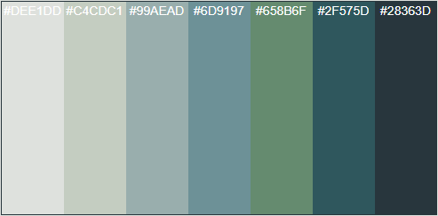
Choosing the perfect palette is crucial for web designers aiming to create visually appealing and cohesive websites. A well-thought-out color scheme not only enhances aesthetics but also improves user experience and can influence the brand's perception. To start, define the goal of your website and consider the psychology of colors. For instance, blue often conveys trust, making it a popular choice for corporate websites, while vibrant colors can attract a younger audience. Once you identify the emotional connection you want to establish, gather inspiration from various sources such as nature, art, or even other websites. Document your preferences and consider using tools like Coolors to explore different combinations.
After gathering inspiration, it's time to create a color palette. Start by selecting a dominant color, then choose complementary colors that align with your primary choice. A solid method is to implement the 60-30-10 rule, where 60% of your design uses your dominant color, 30% uses a secondary color, and 10% is an accent color. This structure provides balance and visual interest. As you finalize your palette, test it on different devices and backgrounds to ensure accessibility and consistency. Remember, the right palette can transform the user’s journey through your site, so take the time to perfect it.
What Does Your Website Color Scheme Say About Your Brand?
Choosing the right color scheme for your website is essential as it impacts your audience's perception of your brand. Different colors evoke various emotions and associations, which can influence user behavior. According to a study by Colorcom, warm colors like red and orange can instill a sense of urgency, making them popular in sales and promotions. In contrast, cooler tones such as blue and green often convey trust and serenity, which can be advantageous for brands in the finance or wellness industries. Therefore, understanding your target audience and what they might associate with specific colors is crucial in building an effective color scheme.
Moreover, consistency in your website color scheme across all platforms contributes to brand recognition and loyalty. Using a unified palette helps ensure that your brand remains recognizable, regardless of the medium. As noted by Forbes, a consistent brand presentation can increase revenue by up to 23%. Therefore, when selecting a color scheme, consider how it will work with various design elements, such as your logo or social media pages, to establish a cohesive brand identity that resonates with your audience.